


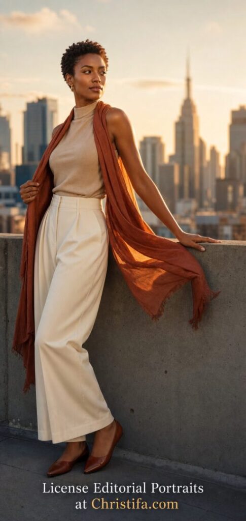
This image study is written by Christifa & Associates Photography and centers on an original fictional adult model photographed on a city rooftop at golden hour for commercial storytelling and image licensing use.

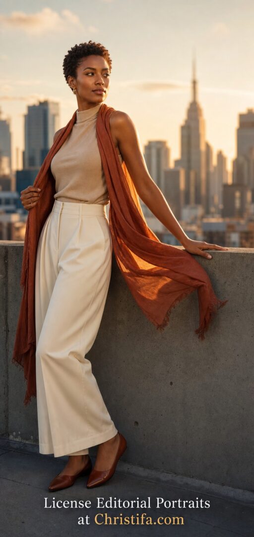
Quiet Authority in Golden Light
Some model portraits work because they are loud. Others work because they are certain. This image belongs to the second group. The fictional adult model stands against a simple rooftop wall at golden hour, and the photograph does not need exaggeration to hold attention. The expression is alert but composed. The pose is confident without pushing into performance. The skyline behind her is recognizable as urban, yet softened enough to stay supportive rather than distracting. Everything in the frame suggests calm authority. That is what makes the portrait commercially valuable. It does not beg for attention. It earns it.
At Christifa.com, that kind of image matters because brands, editors, and marketers often need photographs that can carry ambition without feeling artificial. A portrait can look polished and still feel human. It can speak to leadership, culture, lifestyle, hospitality, fashion, consulting, or creative services without being trapped inside one narrow campaign. This rooftop study demonstrates how to build that flexibility on purpose. Light, wardrobe, pose, negative space, and color all work together to create an image that is memorable and adaptable at the same time.
The Location Gives the Story Altitude
The rooftop setting does more than provide a city background. It creates emotional altitude. We are not at street level where signs, traffic, and storefront clutter compete for attention. We are above the rush, looking into a skyline softened by evening haze. That choice changes the reading of the image immediately. The portrait feels aspirational, but not detached. It suggests progress, perspective, and a certain calm that comes after effort. Those are useful ideas for commercial storytelling because they map naturally to brands that want to communicate vision, professionalism, and modern confidence.
Location selection is one of the most important best practices for photography buyers. A strong location should add meaning without stealing the scene. Here, the rooftop wall grounds the subject physically while the blurred skyline expands the narrative. The viewer understands the environment in a second. It is urban, elevated, and professional. That is enough. The image does not need a busier set design because the story has already been established. Buyers looking for licensable imagery should always ask whether the location supports the message in this efficient way. If the answer is yes, the image usually has longer commercial life.
Wardrobe That Feels Refined Without Feeling Distant
The wardrobe is one of the strongest decisions in the frame. Ivory wide-leg trousers, a sand mock-neck top, warm brown flats, and a rust scarf create elegance without formality. Nothing feels over-styled. Nothing feels careless. That balance matters because commercial portraiture often fails when wardrobe choices lean too hard in either direction. If clothing becomes too corporate, the image can lose warmth. If it becomes too casual, the image can lose authority. This styling lands in the productive middle. It feels premium, but still reachable.
The scarf deserves special attention because it performs several jobs at once. It introduces motion into an otherwise still portrait. It lengthens the figure visually. It adds a second warm tone that ties the subject to the evening light. Most importantly, it creates shape without clutter. For photographers and buyers alike, this is a useful reminder that one well-chosen wardrobe accent is often more effective than multiple accessories. Strong styling is not about quantity. It is about giving each piece a visual purpose.
Expression and Pose Build Trust
The model’s face is turned slightly away from the camera, which gives the portrait forward energy. She is not performing for the lens as much as she is thinking beyond it. That small directional choice changes the emotional temperature of the image. A direct gaze can feel confrontational, intimate, or sales-driven depending on context. This off-camera look feels more editorial. It invites the viewer to follow her attention rather than simply consume her presence. For branding and licensing, that can be extremely useful because it gives designers and writers room to build a story around the image.
The body language is equally disciplined. One hand gathers the scarf near the torso, keeping the composition contained. The other rests on the rooftop edge, adding stability and a sense of place. The pose does not twist aggressively or create unnatural angles. Instead, it lets posture do the work. Buyers should pay close attention to pose language when selecting model imagery. A good pose does not just flatter the subject. It clarifies the message. In this case, the message is capability with ease. That is a powerful combination for any brand that wants to feel elevated but approachable.
Lighting That Sells Atmosphere and Skin Tone
Golden-hour light is easy to romanticize and easy to misuse. In this image, it works because it remains controlled. The sunlight comes from camera-right and behind the model, creating a warm rim along the arm, jawline, and scarf while leaving enough front exposure for facial detail and natural skin tone. The effect is luminous, but not washed out. Highlights stay elegant. Shadows stay descriptive. This is the kind of light that can carry a premium mood without turning the portrait into fantasy.
For photography buyers, lighting quality should always be part of the licensing conversation. Ask whether the light supports the intended emotional message. Ask whether skin tones look honest. Ask whether the highlights leave room for text overlays or campaign crops. In this portrait, the answer is yes on all three counts. The warm background glow creates atmosphere, while the subject remains clearly readable. That is what makes an image work across editorial articles, service pages, homepage hero areas, and brand storytelling assets. Beautiful light is not enough. Usable light is what creates commercial value.
Color Harmony Keeps the Portrait Flexible
The color palette is intentionally narrow. Amber sunlight, rust fabric, ivory tailoring, sand knitwear, slate gray concrete, and muted blue-gray buildings create harmony without monotony. These colors sit comfortably beside many brand systems because they are expressive without becoming loud. A buyer could use this image in content about leadership, wellness, design, fashion, urban hospitality, or modern entrepreneurship and still have room for branded typography or layout treatment.
This is one of the clearest takeaways for marketers and creators choosing imagery. A photograph with a controlled palette often has more working life than an image built on novelty colors alone. That does not mean neutral always wins. It means the palette should contribute to the message and leave room for application. Here, the warmth communicates optimism and polish. The concrete and skyline keep the portrait from becoming soft or sentimental. The result is emotional range with practical restraint.
Composition Leaves Room for Real Use
The composition is not just attractive. It is functional. The subject occupies the left and center of the frame, while the skyline and sky provide open space around the head and shoulders. That negative space matters in commercial use. Designers often need room for a headline, a product callout, or campaign copy. Images that are visually strong but too crowded can become difficult to license because they fight the layout. This portrait avoids that problem. It respects the future page before the page is even designed.
The bottom call to action also demonstrates an important lesson. Text placed on an image should feel integrated rather than pasted on. Here, the CTA sits in a dark lower band where readability is strong and the photograph remains legible. It does not interrupt the portrait. It completes the business purpose of the image. That is the kind of thinking photography buyers should look for when evaluating visual assets for landing pages, blog features, and promotional material. An image is stronger when it anticipates how it will actually be used.
Why This Portrait Has Licensing Value
Licensing value comes from more than beauty. It comes from clarity of use. This portrait can support personal branding, editorial storytelling, creative agency campaigns, consulting pages, women-in-business features, fashion and lifestyle articles, event promotions, or gallery-led marketing. It feels specific because of the rooftop setting and evening light, but it remains broad because the styling and expression are controlled. That balance is what many buyers need. They want something distinctive enough to feel curated, but flexible enough to live across several touchpoints.
When licensing model imagery, buyers should think through scope before falling in love with the look alone. Consider where the image will appear, how long it will be used, whether exclusivity is required, whether crop variations will be needed, and whether the visual tone aligns with the surrounding brand language. A strong portrait should make those decisions easier, not harder. This one does. It offers a clear subject, a clean environment, natural skin rendering, strong styling, and adaptable negative space. Those are practical advantages, not just aesthetic ones.
What Buyers Should Look For in Editorial Model Imagery
If you are selecting images for a campaign or content library, start with story before spectacle. Ask what the viewer should feel in the first two seconds. Then ask whether the pose, wardrobe, location, and light support that feeling consistently. Look for images where the styling has intention, the expression feels believable, and the background strengthens the subject instead of competing with it. Be cautious with photographs that are visually dramatic but difficult to place in real marketing use. High-impact imagery is useful only when it remains usable.
It is also worth studying whether the image respects authenticity. This portrait succeeds because it feels art directed without feeling synthetic in mood. The model looks like a person with purpose, not a mannequin wearing an idea. That distinction is essential for modern brands. Audiences respond more strongly to images that feel emotionally legible. Authenticity does not mean casual execution. It means the photograph allows viewers to believe the world it presents.
A Rooftop Study With Long Commercial Life
For Christifa & Associates Photography, this image is a strong example of what model-focused editorial work can accomplish when every element has a job. The location supplies aspiration. The wardrobe supplies polish. The pose supplies trust. The light supplies atmosphere. The color palette supplies flexibility. The composition supplies room for design. That combination creates a portrait that can live as art, education, or a licensing asset without losing its identity.
That is the standard worth aiming for. A valuable commercial portrait does not merely show a model in a beautiful place. It builds a believable story that buyers can adapt with confidence. This rooftop image does exactly that. It proves that thoughtful restraint can be more persuasive than visual noise, and that the strongest editorial portraits often feel the most effortless because every decision underneath them was deliberate.
Explore the gallery, review licensing options, or contact Christifa for editorial portraits that combine atmosphere, authenticity, and commercial clarity.