


What makes this frame work
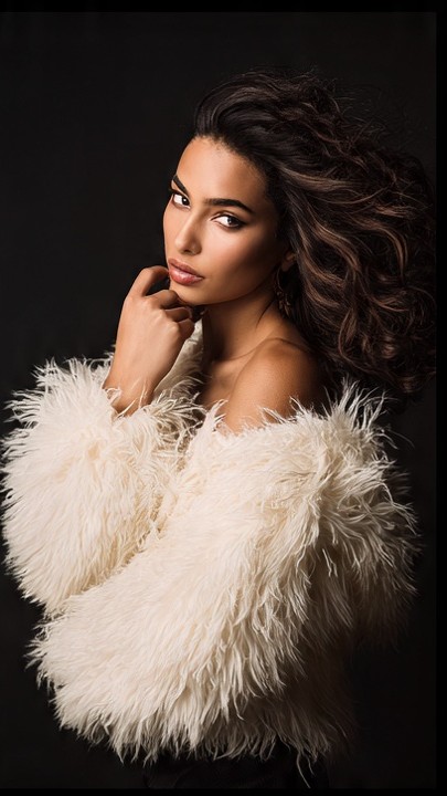
This portrait feels luxurious because it leans on touchable texture rather than ornament. The ivory faux-fur wrap creates instant softness, while the subject’s direct expression keeps the image from drifting into costume territory.
Wardrobe and color story
The ivory palette is the center of the design. It pushes forward against the dark background and lets the subject glow without needing bright color. That contrast is a classic fashion trick because it makes the clothing feel expensive and the skin tone feel luminous.
Light and framing
The light is shaped to preserve the fluff and volume of the fabric. You can still see the edge detail in the faux fur, which matters because texture is the real subject here. If the highlights got too hot, the whole concept would flatten.
Direction and mood
The pose keeps one shoulder bare and the other wrapped, which adds a little asymmetry and gives the frame movement. That tension is what makes the image feel editorial rather than purely decorative.
Teaching takeaway
For photographers, this is a useful lesson in contrast management. Use a dark background when you want pale wardrobe pieces to feel more sculpted, and keep the expression calm so the texture stays in charge.
Licensing note
The image works well for licensing because its color palette is simple and adaptable. Designers can crop it tightly for a detail-led layout or use it full frame when they want the fabric to do the talking.
Call to action Discover more image analysis, teaching articles, and licensing guidance at Christifa.com.